Ageing Curves: Part II
My last post used historic data from over 1,500 players to construct ageing curves that show how batting performances improves and declines with age. The approach was to find season couplets where the same player played two seasons in a row and looked at how their performance changed. This was the result:

Players improve fast in the early years of their career, enjoy 10-15 years of fairly consistent performance and then decline as they enter old age in their late thirties. However, as we will see, this curve probably exaggerates the real rate of improvement and decline at either end of the curve
In this post we will see how these curves change depending on the players included in the analysis. In some cases, it reveals genuine differences between player types and, in other cases, potential limitations in what was originally quite a naive approach
It is worth clarifying some of the finer points of methodology, especially the metric being used to measure performance. I am using Runs Added which was originally a statistic based on the outcome of every single ball and how much a team's expected final total changes as a result
As a simplification, it is worth considering that the average T20 score is approximately 155-160 which equates to a strike rate of about 130; if a player is scoring slower than this then their teams expected total is going to reduce, and if they are scoring faster it will increase. The result is that we can quantify how much each player contributed to their team's total over the course of a single match. The average score is 0 (no impact) and it can take both negative (bad) and positive values (good)
However, I do not have ball-by-ball data for every T20 match but I do have most scorecards. I created a simple regression model to estimate Runs Added using only the information available in a basic scorecard. The result may well be a better approximation of value than my original Runs Added metric (which was quite good) as it avoided the complication of low-scoring matches where even fast scoring batsmen cannot add many runs to their team's expected total when they a chasing a small target
Handedness
One question was whether left-handed batsmen age differently to right-handed batsmen. It seemed plausible. Aesthetically, the top left-handers in the world always seem smoother to watch There is also research indicating that playing left-handed could benefit even right-dominant players, with Chris Gayle being a prominent example

Initially, it does seem like there is a difference. It seems left-handed batsmen improve faster and decline faster... but there is a reason that I included an indication of sample size on this chart. The differences may well exist, but I am not willing to accept these differences at face value when the sample size is so small
Comparing the overall performance of left-handers against right-handers, there is almost zero difference between the two. This is a game-theory-esque optimisation at work within pro cricket: it may be beneficial to play left-handed but the result is not that the average left-hander in professional cricket is more productive, it is that we have more left-handers in professional cricket (about 25% vs. 10% in the wider population). Less otherwise talented cricketers who are able to play left-handed enjoy a boost that allows them to play at a higher level
Given the overall equality between the two populations, and without a clear understanding of how being left-handed might affect how players age, I am reluctant to differentiate between the two types
Batting Order
Do openers age differently to middle order batsmen? How about tail-enders? The chart below separates the overall ageing curve based on the average batting position for each player over the course of their entire career. For a small number of players, such as Narine who started pinch hitting (?) at the top of the order, this doesn't do an adequate job of defining their position but for most players it is good enough

Players who typically bat at number 7 or lower do not age as quickly as other batsmen. Partly, this is caused by the fact that there is often a limit to the amount of value a player can add when most of the wickets have already fallen; sometimes they have just one over or one ball to add value. This means that the changes in performances (as shown by an ageing curve) are also limited as there is only so far a player can rise or fall
This is also applies to the disparity between the openers and the middle order. Middle order batsmen also have lesser opportunity to accumulate value than the openers, albeit to a lesser extent than for the tail. To see the impact of this I started filtering my sample based on the number of balls faced on average in each season. If I limit the analysis to only batsmen who faced at least 10 balls on average in both seasons then the gap between the "Openers" line and the "Middle" line shrinks by about 1.5 runs
There are also issues with survivorship bias here, which affects the tail and middle order much more than the opening batsmen. The next section covers this in more detail...
Career Length
Finally, I split the results by career length (measured in innings). The resulting chart is a clear demonstration of the impact of survivorship bias that affects all the charts so far

Look at the curve for players who batted for less than 10 innings in total. It is almost entirely sloped downwards. This is mainly caused by players on the fringe. Players who have a decent season in one year, (decent enough to warrant a second season) but struggle in their second season and are subsequently dropped. In many instances, the player will be enjoying a purple patch in that first season - over-performing relative to their underlying talent. In other instances, they are under-performing in their second season but don't get the opportunity to turn it around. The trajectory for these players is inevitably downward
Consider two completely average players, in identical situations, who play across three consecutive seasons. In each season they are expected to deliver zero value above an average player. In reality, Player A delivers seasons worth {0, +1, -1} and Player B delivers season worth {0, -1, +1}. If we were to calculate an average ageing curve then we would see no rise or decline in performances. But what if Player B's team decides not to play him in the third season {+1} due to his poor performance in the second {-1}. He would now be excluded from the analysis when calculating the difference between season 2 and season 3. The ageing curve would now show a dip caused by the fact that Player A declined from {+1} to {-1}. This is the survivorship bias in action
And then we have the batsmen who enjoyed 25+ innings. These batsmen appear to age better than other players. But again this is partly driven by survivorship bias. They are lucky enough not to suffer a temporary dip in form which ends their careers. Some of the 11-25 inning group may have had they careers cut short early due to a few unlucky knocks and selectors concluding that their time is up
Unfortunately, correcting for survivorship bias isn't straightforward. This article - link - provides a solution by giving players 'phantom' innings at an expected performance level to mitigate against the bias. But it is still relying on some original ageing curve to determine what the expected performance level should be
Correcting for my problems with batting position and the lack of opportunity for players lower down the order is a lot easier. One way would be to separate performance into two components - strike rate and innings length - and model them both separately. Modelling for innings length actually isn't particularly necessary because my base metric (runs added) is centred around zero
For now, what I have done is weight my sample based on the number of innings played in each season. For young players (<25) the weighting is based on their second season and for older players the weighting is based on their first season. This mitigates slightly against the survivorship bias in the data
I also split my curves between batsmen (1-6) and bowlers (7+). Distinguishing between middle order and openers seemed unwise given that players so often switch between roles. However, I did also limit the data to only include consecutive seasons where the player's average batting position did not change by more than one place in the order
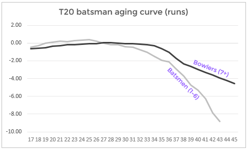
Note how much flatter the curve becomes at the start with a bit more attention to the analytics. I have deliberately used the same scale as in the chart at the top of this post. The decline is also slightly flatter but this is masked by the fact that I also split out the bowlers as a seaparate line